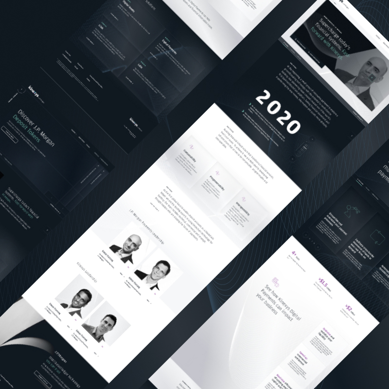

Leading our digital marketing and design team to create a digital content platform and interactive experience that houses content from the collaborative print magazine, Payments Unbound, published by WIRED and J.P. Morgan.

As the lead UX/UI designer, i received their request to host the PDF version of the magazine of a landing page and suggested that we create a more user-centric and engaging version of the magazine.
Assembling the necessary roles, and allocating the right resources, I lead the way in designing and creating the experience from scratch.
The project was informed by user interviews, guided and unguided testing, and stakeholder UX workshops.

The first step in creating Payments Unbound's web experience was to gather information from the stakeholders and determine the scope. Initially J.P. Morgan wanted only to house a PDF version of the magazine on a server, I saw opportunity to make something bigger.
Statistically, PDFs are not as engaging a format for digital content consumption. Consider this; a World Bank study found nearly one-third of their PDF reports had never been downloaded, and another 40% were downloaded fewer than 100 times. PDFs don't scale with mobile devices and cannot be updated. From a user, and business perspective it makes sense to create a digital version.
Knowing this, I assembled the resources we needed, a team to do user research, a development team, and several designers to assist in standing up the experience. To do so required pitching a proof of concept to secure the funding and resources to build the page. Once leadership saw the potential, and had clear-cut steps to get there, we were ready to begin.
The initial concept was simple, take the articles from the magazine and copy them directly onto a webpage, creating a scaleable, digital version
Though that's how it began, it has been iterated upon consistently over the magazine's run. The most recent version was developed based on years of user research and stakeholder interviews. Over time, it became apparent that we could be doing more with the digital version than hosting a magazine. We could do podcasts, webinars, interviews. Based on this scope I developed a vision for a content platform that could wow users, but also provide them a wealth of content.
The plan was straightforward enough, the first step was to determine what the goals of the site are, and what success looks like. I determined that the main goal of the site is to distribute content, therefore, our key metrics would be around scroll depth, time on page and shares. Based on these goals I determined what pages we would need. We would need one page for each type of content, each article and a homepage at the very least. I started mapping out the page structure, then I dove into each page in more detail. Structuring the information they would need to display.
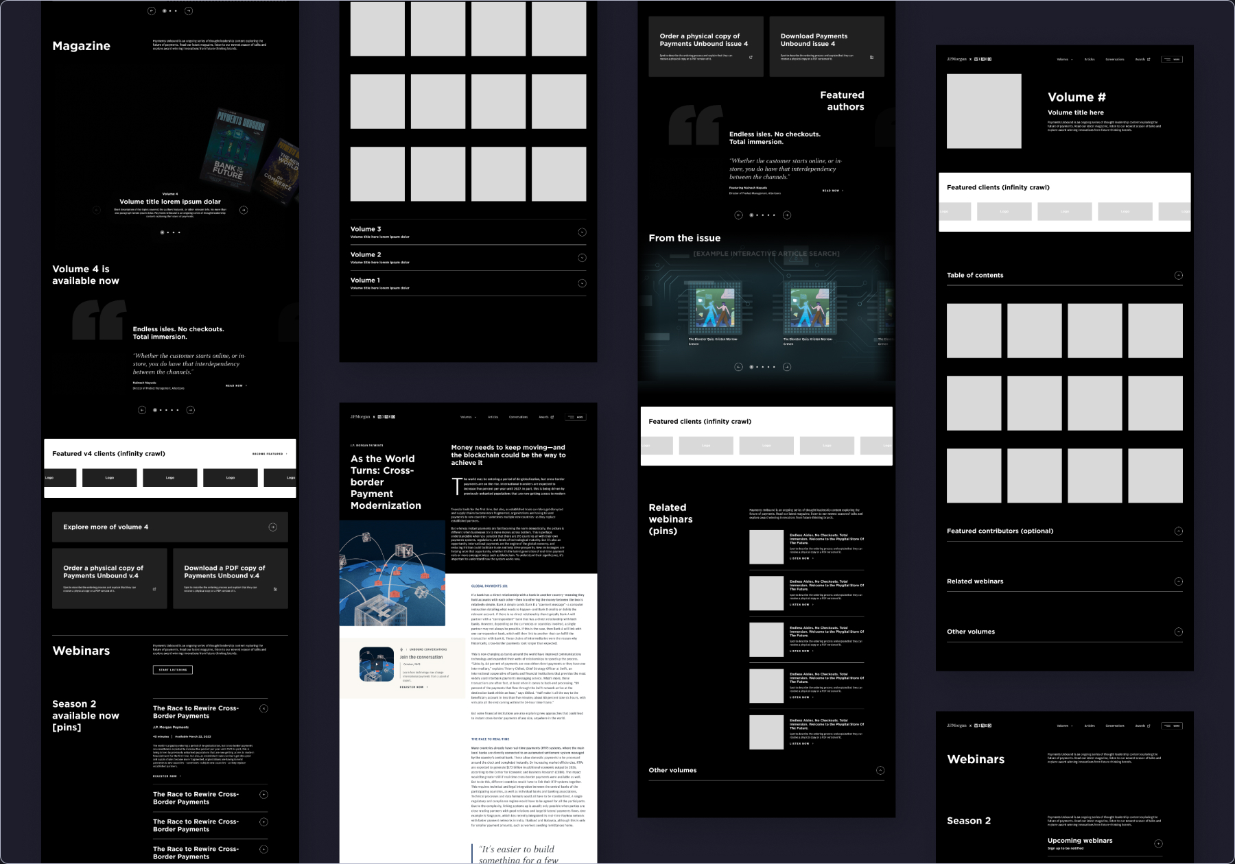
Once the site had been mapped out I developed wireframes of the initial design, then proceeded mocking up a prototype.
To create the prototype, I engaged and lead a team of UI designers to coordinate the creation of individual pages. While I created the overall framework—designing templates for articles, layouts for critical pages and instructing their direction— they proceeded to build off my work and help realize the full prototype.
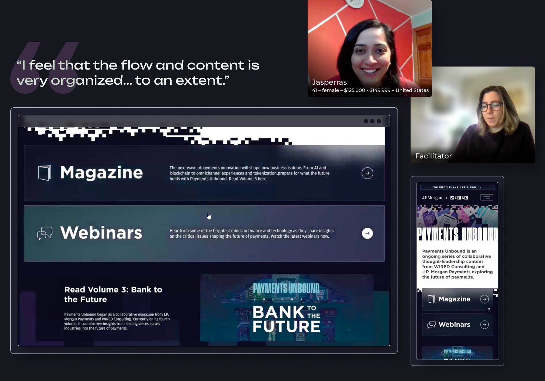
Once complete, I organized the user testing team to perform interviews for both desktop and mobile versions of the site. The tests showed promising results, and helped to uncover inefficiencies and flaws that were then rectified. We launched this design and gathered metrics over time to see our results. We found that it performed well, but that people are taking too many clicks to get to content, we also discovered which content was performing well, and which was not, helping me to better categorize the articles.
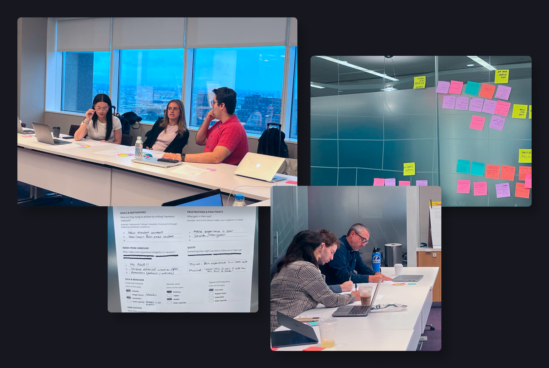
Based on our results year-over-year, I regrouped the stakeholders and launched a UX workshop to determine the best course of action.
Facilitating the workshop, I directed the group to share data we had collected as a team. Over the course of the workshop we organized the articles into more logical and searchable categories, developed updated user personas and discussed what the future of the platform should be, and what possible competitors we could analyze.
Once I had a solid focus on the new direction I re-engaged the team to create a new prototype that has much more straightforward site architecture, enhanced searching functionality and a layout conducive to providing and suggesting content we know performs well with users.
Based on competitive analysis, I also developed an engaging experience that is launched alongside the full site, serving as a way to announce and promote the latest issue.
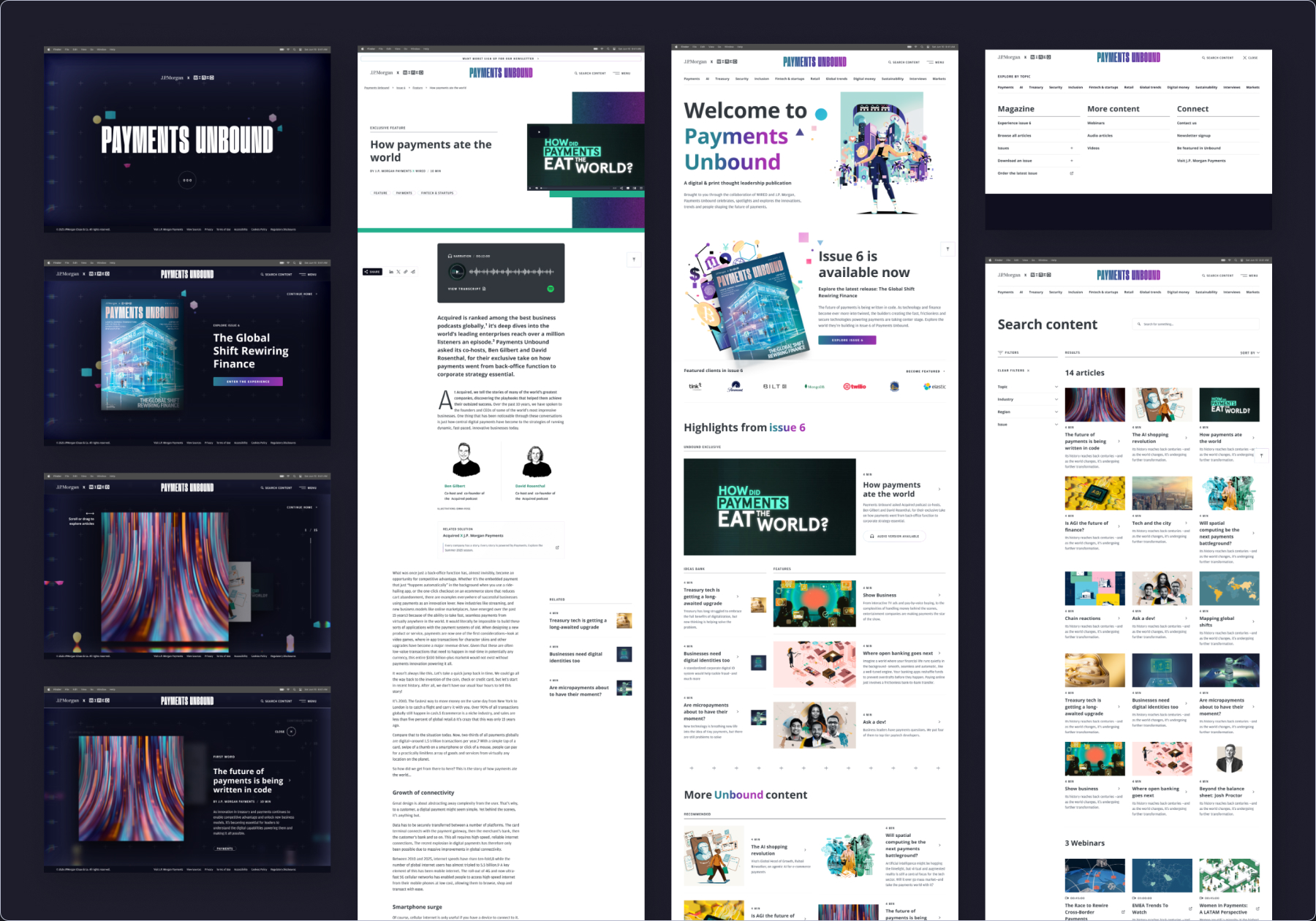
Presently, Payments Unbound incorporates all of our learnings over the course of 4 years into a design that both engages and delights users with an interactive experience, and optimally hosts and sources exceptional content from industry leaders in a way that makes sense to our users. See it for yourself
The results were very promising. The visitors per year are high, people scrolled through the page—often outperforming the industry average of 50%—and most importantly, people were getting to, and reading the articles. The industry benchmark for article page read time is 1 minute at the low end and 5 on the high end, our 4 minute stat shows the design works.
Do I have your interest?
Then let's talk, reach me at
Matt @ Matthew Design.net