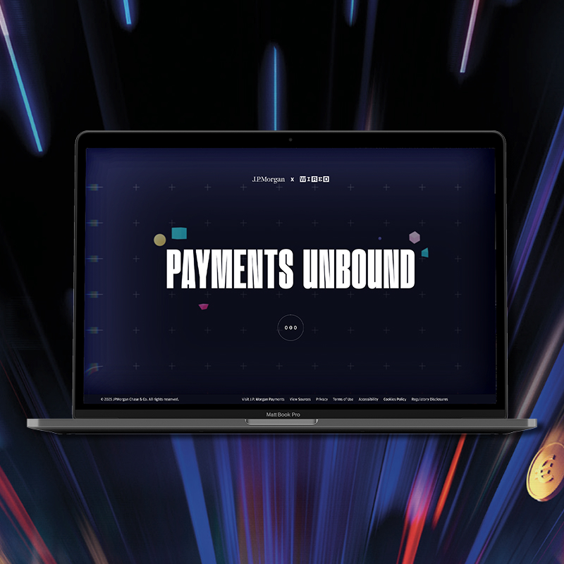

A set of landing pages for a multi-region marketing campaign, relaunching J.P. Morgan's B2B commerce payments solutions.


In my role I developed the UX strategy per region, designed the pages, helped to refine the messaging and brought in resources to interview users and test designs in order to ensure success.

Previously, J.P. Morgan had launched a marketing campaign to introduce a suite of products meant to compete with established industry titans like Stripe and Adyen.
The products themselves were very marketable. They are well built, they carry the backing of one of the biggest names in finance, but they failed to resonate with potential customers. The reason for this was messaging and UX strategy.
Previous attempts at launching a campaign were controlled in the internal vacuum of the J.P. Morgan marketing offices. They hadn't done research into their potential users, tested any of their designs or tailored their messaging, instead they took a top-down approach, and it wasn't working.
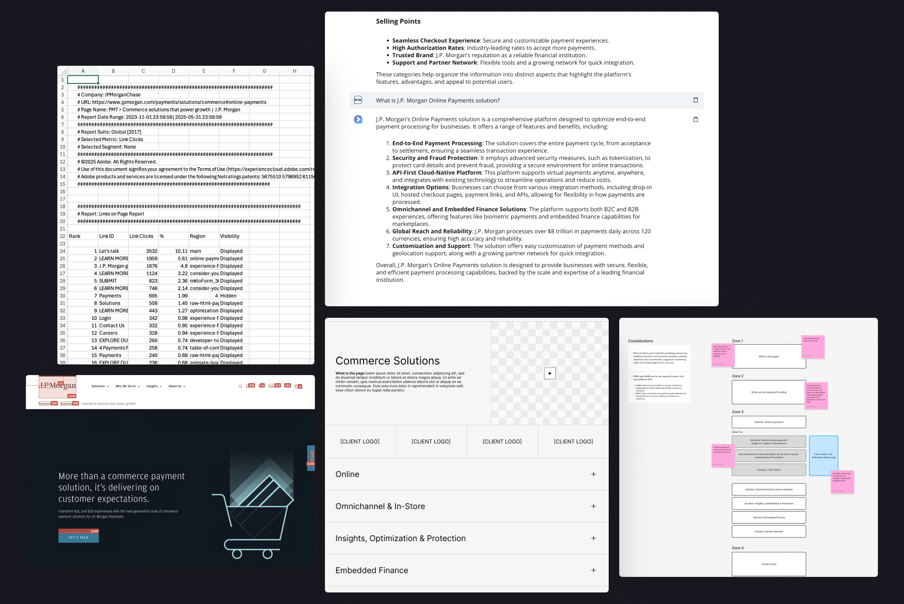
Being familiar with their previous campaign attempting to launch their commerce solutions, I was already aware of the flaws, the page was one of, if not the, worst performing pages that promoted solutions on their site. High bounce rates, confusing and vague language, unfocused messaging and low engagement were the problems I needed to address.
Once made aware of interest in re-visiting the campaign for a potential relaunch I took the initiative. I put together a detailed report of the page's performance and created a plan to bring a proposed solution to the project's kick-off meeting.
After initial briefings and discussions, I next begin conceptualizing the structure for each page. This process involved both developing the story of the primary page layout and it’s functions, both of which are based on data available from testing, previous user interviews, stakeholder input and known UX best practices. I created a set of key considerations for the page, and broke it down into zones of content to organize our messaging, attaching key functions to each zone. I did this through a combination of competitive analysis, auditing any of our existing, similar content and any other relevant methods that may apply.
For this campaign I utilized LLM in order to break down our product offering into a digestible format, using that as the framework for key information.
I followed the appropriate UI development framework of first organizing the content, then creating wireframes, refining them, then creating a high-fidelity version to be pitched internally
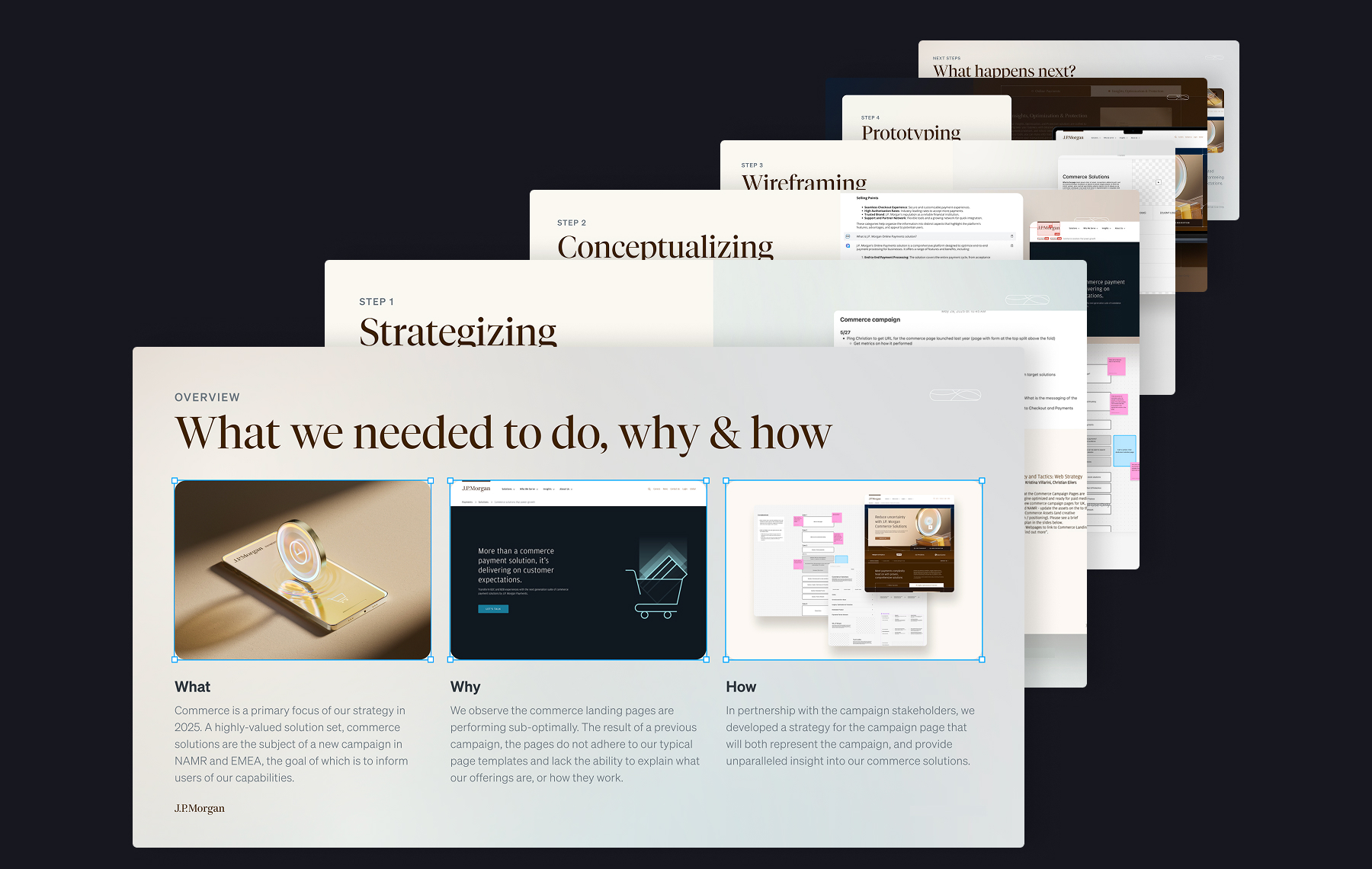
Once I had an initial design ready to be shown to the internal stakeholders, I brought it to them in the form of a presentation. I explained what we need to do, why, and what my plan was to do it.
After receiving buy-in from the group, I used internal resources and data to develop strategy and messaging, but now could incorporate more internal resources to bring in copywriters, content strategists and SEO experts to refine the direction.
Once I and the other subject matter experts involved felt strongly about the direction and strength of our prototype I created refined versions for both desktop and mobile devices to be tested.
Testing involved refining a version of the pages for each major region in which the campaign would be active, primarily LATAM and EMEA. We then worked with our user-testing resource teams to find interviewees from each reaction to show the pages. We focused on gathering people from large business, in treasury, tech or commerce roles, and crafting a loose interview script that focused on whether they could find relevant info on the pages, whether the messages were resonating with them, and how well they felt this represented J.P. Morgan and our solutions.
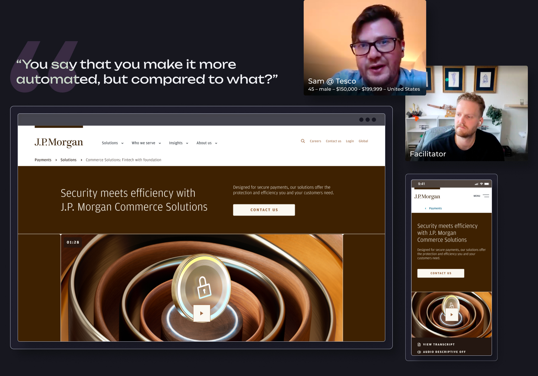
The results were telling. The users found the messaging we developed based on internal influences to be too vague, too "jargon-y" and lacking real substance and practical examples. We also found that we were trying too hard to fit too much info into too little space, UI interactive elements such as tabs fell flat, and the varied layout of sections weakened their ability to categorize and connect sections to eachother.
Based on their feedback we identified information and language that would resonate more with them. We found that users were primarily swayed by seeing solutions in action, real-life case studies and success stories. We also found that users were influenced heavily by client-related success metrics, had our involvement increased business? Had we reduced cart abandonment? had we reduced the time to transfer funds cross-borders? All requested information.
Our strategy shifted slightly, I would now create a version that heavily integrated these key pieces of information, the copywriters would remove the jargon and speak much more plainly. The strategy of the page was still to introduce the solutions with an anthem video, then provide a brief definition of the offerings. But immediately thereafter we would reinforce them using existing client stories and statistics.
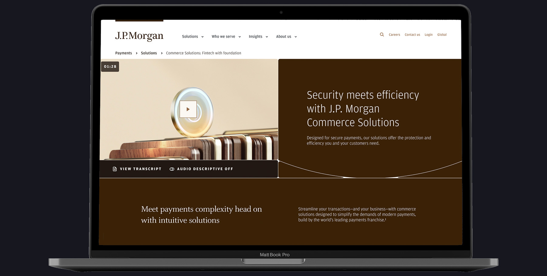
The final version of the pages was much better received during testing. Overall we were able to address past issues with our messaging and presentation of these solutions and enter the market on strong footing.
For the business, the key goal was to inform users and relaunch their solutions through an aggressive video campaign. The goal of the page was to provide users a space to watch the video, then provide them with more information about the solutions, and enough justification to know they are a quality service that can be relied upon. Based on the video completion and clickthrough rates, we succeeded handily.
Do I have your interest?
Then let's talk, reach me at
Matt @ Matthew Design.net